Combine CSS Modules with Tailwind CSS
There is another approach to using Tailwind in Next.js, which involves combining CSS modules with Tailwind using the @apply directive.
Converting to CSS Modules
Recall that the ProductCard component has a container class for the wrapping div:
export const ProductCard = ({ product }: Props) => {
  return (
    <div className="@container">
      <div className="flex flex-col @md:flex-row">
    ...
Let's convert it to use CSS modules instead.
To do this, we'll create a new file called ProductCard.module.css. Inside this file, we'll define a new class called card and apply the @container class to it with @apply:
/* inside ProductCard.module.css */

.card {
  @apply container;
}
Back in the ProductCard component, we'll import the CSS module:
import styles from './ProductCard.module.css';
Then, we'll replace the @container class with styles.card:
// inside the ProductCard component
<div className={styles.card}>
  {/* ... */}
</div>
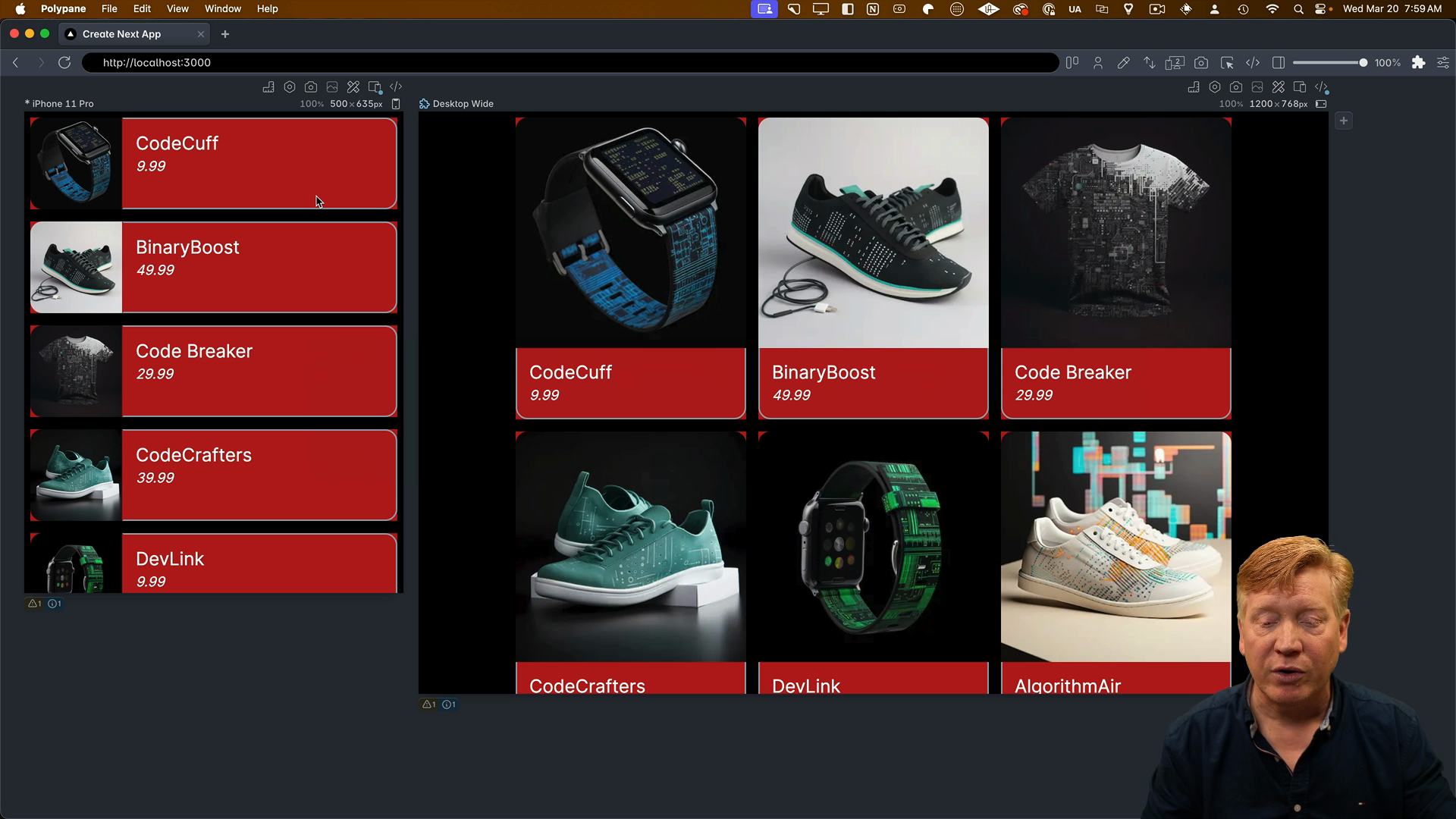
After saving the changes, we can check the result in PolyPane, and it should look just fine:

Applying CSS Modules to the Entire Component
Let's take it a step further and apply CSS modules to the entire component. We'll create classes for each section of the card in the ProductCard.module.css file, using the @apply directive to apply Tailwind classes:
.card {
  @apply @container;
}

.cardContainer {
  @apply flex flex-col @md:flex-row;
}

.imageContainer {
  @apply w-full @md:w-1/4;
}

.image {
  @apply w-full h-auto rounded-tl-2xl rounded-tr-2xl @md:rounded-tr-none rounded-bl-none @md:rounded-bl-2xl;
}

.infoContainer {
  @apply w-full @md:w-3/4 pl-4 border-b-2 border-gray-400 rounded-br-2xl rounded-bl-2xl @md:rounded-bl-none border-l-2 @md:border-t-2 rounded-tr-none @md:rounded-tr-2xl border-r-2 @md:border-l-transparent;
}

.title {
  @apply text-2xl mt-4;
}

.price {
  @apply text-lg mb-4 italic;
}
Next, we'll update the class names in our component to reference the classes we created in the CSS module:
export const ProductCard = ({ product }: Props) => {
  return (
    <div className={styles.card}>
      <div className={styles.cardContainer}>
        <div className={styles.imageContainer}>
          <Image
            src={product.image}
            alt={product.title}
            width={300}
            height={300}
            className={styles.image}
          />
        </div>
        <div className={styles.infoContainer}>
          <h1 className={styles.title}>{product.title}</h1>
          <p className={styles.price}>{product.price}</p>
        </div>
      </div>
    </div>
  );
};
After saving the changes, we should see the same look and feel as before. However, from a readability standpoint, using CSS modules can make the code more readable and maintainable.
Combining CSS Module Classes with Inline Styles
It's important to note that the values of card, cardContainer, imageContainer, etc., are simply strings. Therefore, you can use them as strings within your className attribute.
For example, you can take the initial styles.card as a baseline and add additional inline styles:
<div className={`${styles.card} bg-red-500`}>
  {/* ... */}
</div>
In this case, we're applying a red background color on top of the existing styles defined in the CSS module:

The Big Takeaway
There's no real magic to CSS modules when used inside a Next.js application. The values themselves are just strings, and you can use them as such.
With that, we've explored how to use CSS modules in combination with Tailwind in Next.js. This approach provides a clean and maintainable way to style your components while still leveraging the power of Tailwind.