When it comes to using Storybook in a monorepo, there are a few different options. In this lesson, we'll look at three approaches for integrating Storybook into a Turborepo monorepo:
- Adding Storybook to a UI library package
- Adding Storybook to a Next.js app
- Creating a dedicated Storybook app
We'll also learn how to run multiple Storybooks simultaneously using Turborepo.
This lesson picks up with the Turborepo setup we created previously.
Adding Storybook to the UI Library Package
Let's begin by adding Storybook to our packages/ui directory, which will allow the UI library to have its own Storybook for showcasing its components.
Navigate to the packages/ui directory in your terminal, the initialize Storybook:
npx storybook@latest init
When prompted for setup, select Vite to use as a builder.
After installing, Storybook will automatically launch. Close the browser window and stop the process.
Inside of the packages/ui directory, you'll find a storybook directory with the Storybook configuration. Remove the generated stories under src/stories.
Create a new file src/button.stories.tsx to define stories for the button component.
Inside the button.stories.tsx file, add the following code:
// inside packages/ui/src/button.stories.tsx

import type { Meta, StoryObj } from "@storybook/react";
import { Button } from "./button";

const meta = {
  title: "Example/Button",
  component: Button,
  parameters: {
    layout: "centered",
  },
  tags: ["autodocs"], // can be removed if not using autodocs
  argTypes: {
    appName: { control: "text" },
    children: { control: "text" },
    className: { control: "text" },
  },
} satisfies Meta<typeof Button>;

export default meta;
type Story = StoryObj<typeof meta>;

export const Primary: Story = {
  args: {
    appName: "Primary",
    children: "Primary",
  },
};
This code defines a story for the button component with a primary variant.
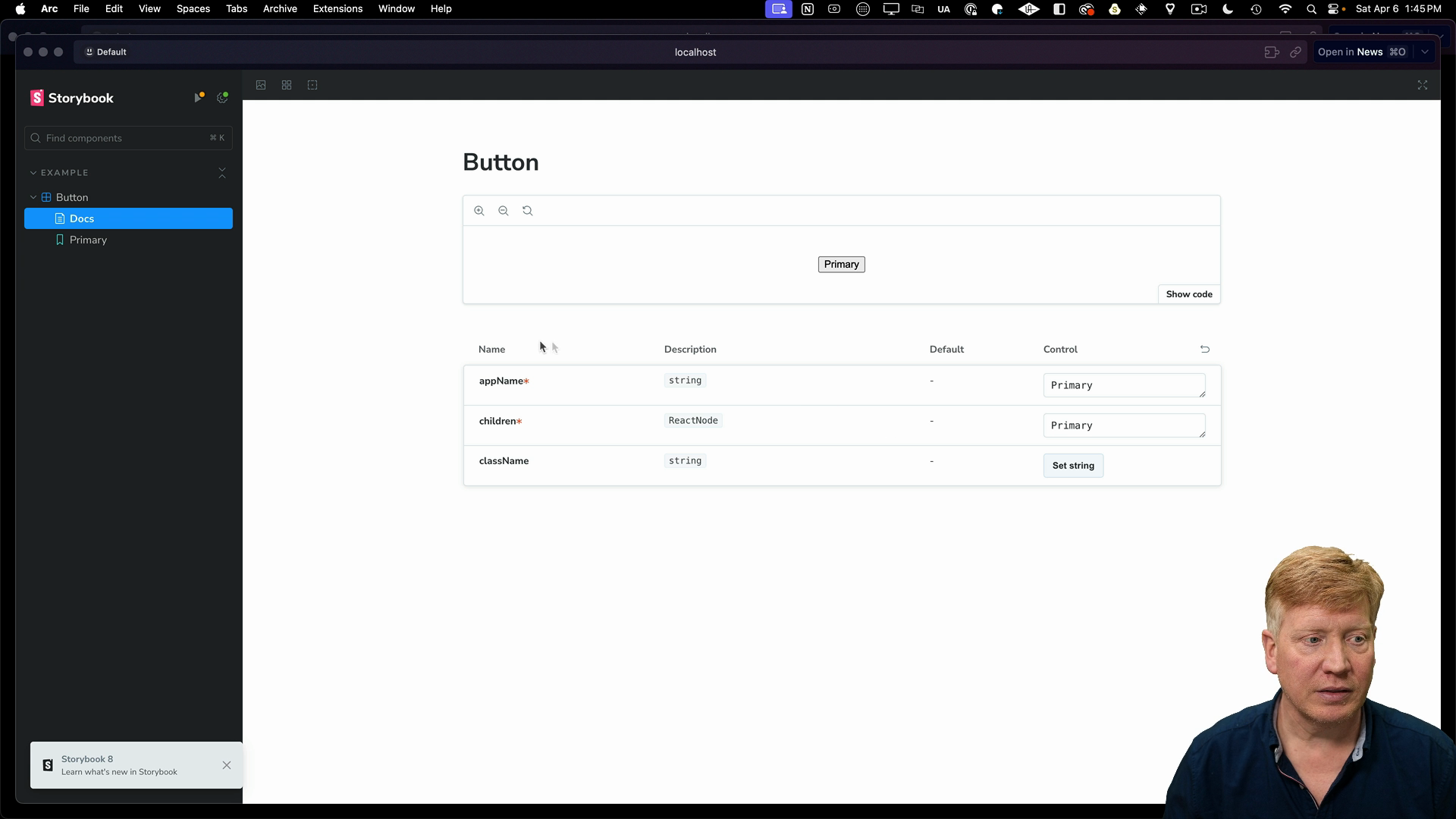
Running pnpm storybook will launch Storybook, and we can see the button component's story:
Storybook also supports creating an MDX file like button.mdx to provide additional documentation:
// inside packages/ui/src/button.mdx
import { Canvas, Meta } from "@storybook/blocks";

import * as ButtonStories from "./button.stories";

<Meta of={ButtonStories} />

# Button

A Button helps you add interactivity to your site

<Canvas of={ButtonStories.Primary} />
Here's how the Button story looks with our custom documentation:
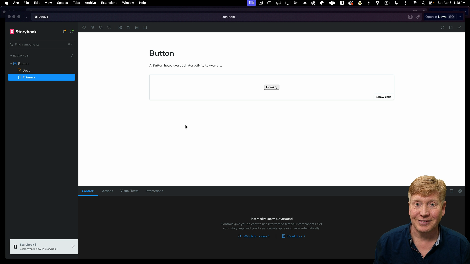
Remember to turn off the autodocs option in the stories file to avoid collision with your own documentation.
That's how you add Storybook to a UI library package in a Turborepo monorepo.
Adding Storybook to a Next.js App
Now, let's add Storybook to the Next.js app within our Turborepo.
Navigate to the app directory at apps/main-site, then run the storybook init command.
npx storybook@latest init
The command will auto-detect the Next.js setup and initialize Storybook accordingly. Like before, we'll remove the generated stories directory to co-locate stories with components.
Let's create a Counter component and its story.
Here's code for the Counter:
// inside apps/main-site/src/app/counter.tsx
"use client";
import { useState } from "react";

export default function Counter() {
  const [count, setCount] = useState(1);

  return (
    <div className="black text-white">
      <p className="text-3xl">Count: {count}</p>
      <div className="flex gap-2">
        <button
          onClick={() => setCount(count + 1)}
          className="px-5 py-2 rounded-full bg-blue-800 text-white"
        >
          Increment
        </button>
        <button
          onClick={() => setCount(count - 1)}
          className="px-5 py-2 rounded-full bg-blue-800 text-white"
        >
          Decrement
        </button>
      </div>
    </div>
  );
}
And here's the corresponding story:
// inside apps/main-site/src/app/counter.stories.tsx

import type { Meta, StoryObj } from "@storybook/react";
import Counter from "./Counter";

const meta = {
  title: "Example/Counter",
  component: Counter,
  parameters: {
    layout: "centered",
  },
  // tags: ["autodocs"],
  argTypes: {},
} satisfies Meta<typeof Counter>;

export default meta;
type Story = StoryObj<typeof meta>;

export const Primary: Story = {
  args: {},
};
Note that the autodocs option is commented out.
Running pnpm storybook will launch Storybook, and we can see the Counter component story:
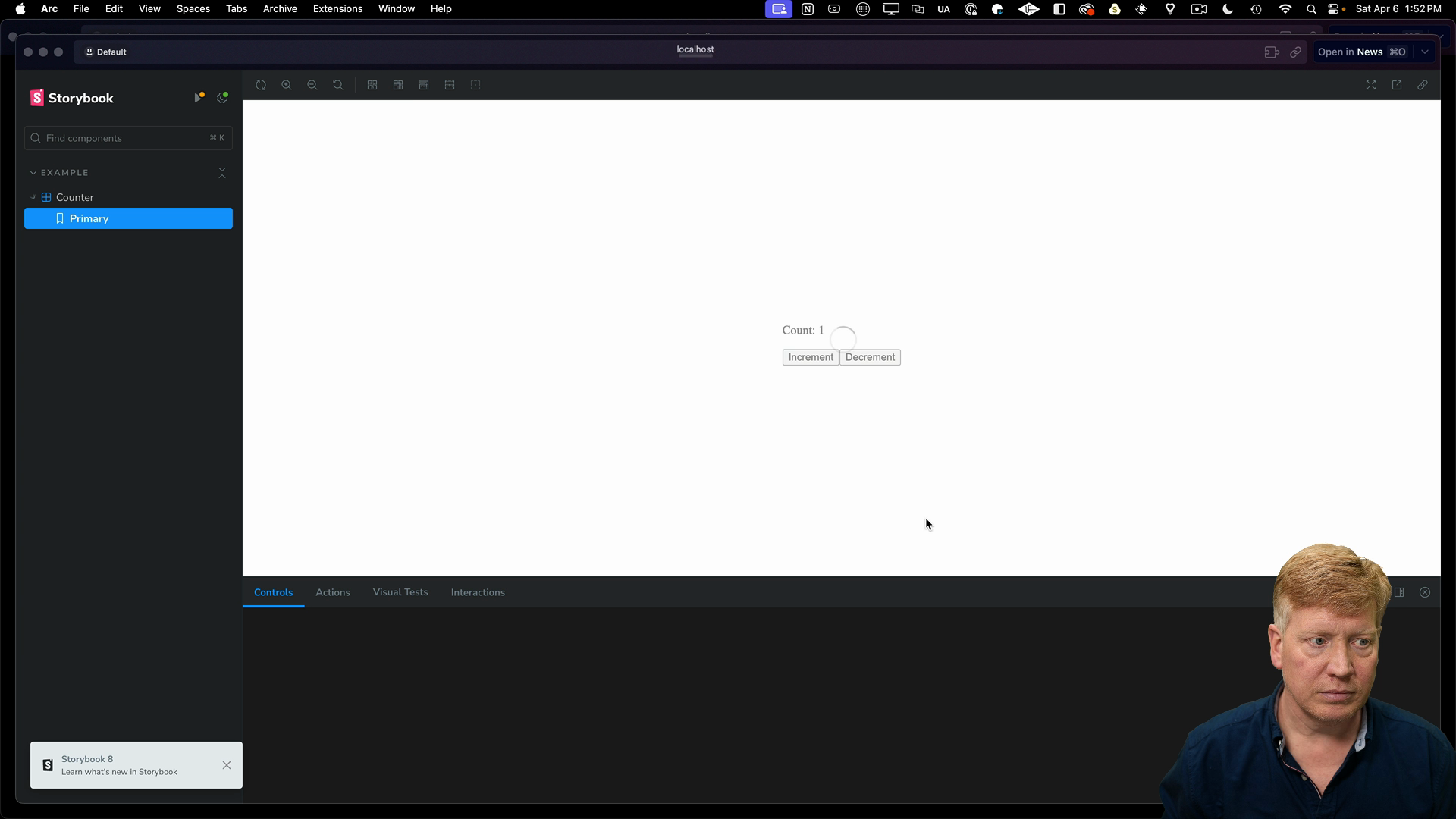
For now, the component isn't styled.
The Storybook Styling Plugin
Stop the Storybook process and install the styling plugin:
npx storybook@latest add @storybook/addon-styling-webpack
Now inside the apps/main-site/.storybook/preview.ts file, add in the global styles which will bring in Tailwind:
// inside apps/main-site/.storybook/preview.ts
import type { Preview } from "@storybook/react";
import "../src/app/globals.css";

...
Now when running Storybook, the Counter component will be styled with Tailwind CSS.
React Server Components in Storybook
Storybook 8 introduced support for React Server Components.
To showcase an RSC in Storybook, create a new Pokemon.tsx file that will fetch and display a Pokemon:
// inside apps/main-site/src/app/Pokemon.tsx
import React from "react";

export default async function Pokemon({ id }: { id: number }) {
  const pokemon = await fetch(
    `https://pokeapi.co/api/v2/pokemon/${id || 1}`
  ).then((res) => res.json());

  return (
    <div className="text-3xl">
      <h1>{pokemon.name}</h1>
      <img
        src={pokemon.sprites.other["official-artwork"].front_default}
        alt={pokemon.name}
      />
    </div>
  );
}
Then create a corresponding story file pokemon.stories.tsx:
// inside apps/main-site/src/app/pokemon.stories.tsx
import type { Meta, StoryObj } from "@storybook/react";
import Pokemon from "./Pokemon";

const meta = {
  title: "Example/Pokemon",
  component: Pokemon,
  parameters: {
    layout: "centered",
  },
  // tags: ["autodocs"],
  argTypes: {
    id: { control: "text" },
  },
} satisfies Meta<typeof Pokemon>;

export default meta;
type Story = StoryObj<typeof meta>;

export const Primary: Story = {
  args: {
    id: 1,
  },
};
In order to enable the RSC support, we need to add some config to the .storybook/main.ts file:
// inside apps/main-site/.storybook/main.ts

const config: StorybookConfig = {
  features: {
    experimentalRSC: true,
  },
  ...
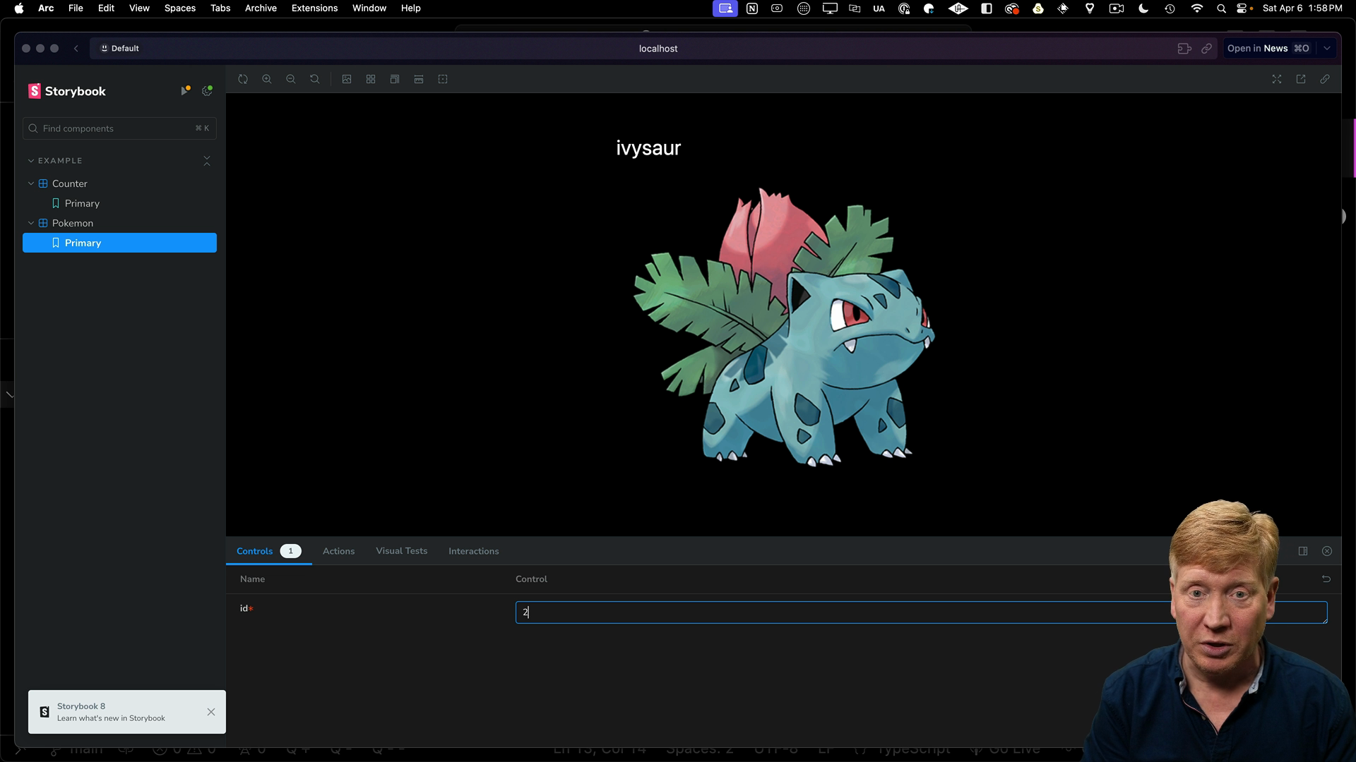
Now when running Storybook, you'll see the Pokemon component rendered with the fetched data. Changing the id prop in Storybook will fetch a different Pokemon:
Note that server actions are not yet supported in Storybook's RSC integration, but they are planned for a future release.
Creating a Dedicated Storybook App
The last example we'll look at is creating a standalone Storybook app.
Navigate to the apps directory, then create a new Storybook app using the Vite React template:
# inside the apps directory
pnpm create vite storybook --template react-ts
After the install command finishes, we will remove the README and the gitignore from the generated Storybook app.
Configuring the Standalone Storybook App
There is some TypeScript configuration we need to do in the shared packages directory of the Turborepo app.
Inside the packages/typescript-config directory, create a new file vite.json:
{
  "extends": "./base.json",
  "compilerOptions": {
    "target": "ESNext",
    "useDefineForClassFields": true,
    "module": "ESNext",
    "lib": ["ESNext", "DOM"],
    "jsx": "react",
    "sourceMap": true,
    "resolveJsonModule": true,
    "noEmit": true,
    "noUnusedLocals": true,
    "noUnusedParameters": true,
    "noImplicitReturns": true
  },
  "exclude": ["node_modules"]
}
Now we can go back to the apps/storybook directory and update the tsconfig.json to just use the vite.json we just created:
// inside apps/storybook/tsconfig.json

{
  "extends": "@repo/typescript-config/vite.json",
  "include": ["src"]
}
We also need to add some configuration to the package.json file. First we'll add the @repo/ui dependency, then for the dev dependencies we'll add the ESLint and TypeScript configurations:
// inside apps/storybook/package.json
  "dependencies": {
    "@repo/ui": "workspace:*",
    "react": "^18.2.0",
    "react-dom": "^18.2.0"
  },
  "devDependencies": {
    "@chromatic-com/storybook": "^1.3.1",
    "@repo/eslint-config": "workspace:*",
    "@repo/typescript-config": "workspace:*",
    ...
Running the Standalone Storybook App
With the configuration in place, we can run the standalone app:
pnpm dev
By default, a Vite app runs at http://localhost:5173 and shows a simple counter:
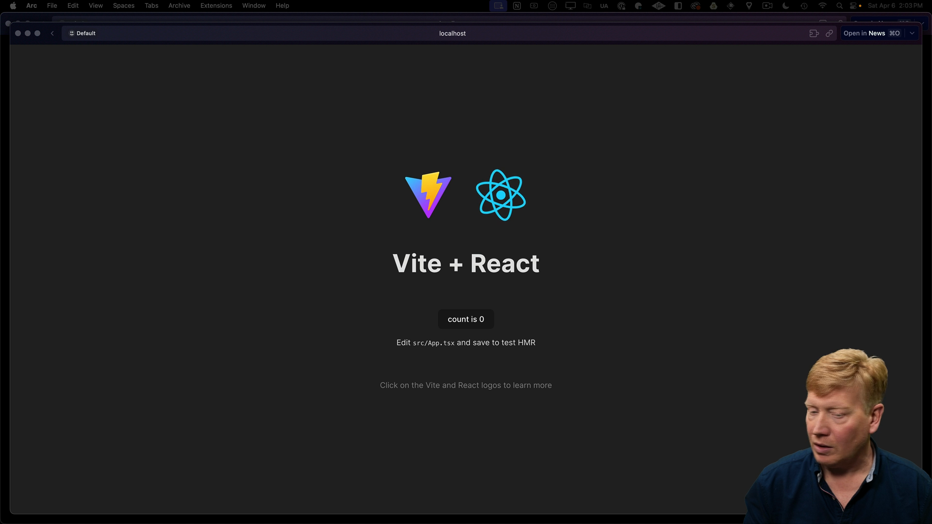
Since we know that Vite works, let's update it to bring up Storybook by default.
To do this, we need to initialize Storybook:
npx storybook@latest init
Storybook will automatically recognize that this is a Vite application.
Inside of .storybook/main.ts we can see that it is currently looking for stories under src. We can remove the stories directory and copy over the stories from the @repo/ui package.
The change we need to make is to have the component be imported from the @repo/ui package:
// inside apps/storybook/src/button.stories.tsx
import type { Meta, StoryObj } from "@storybook/react";
import { Button } from "@repo/ui/button";

const meta = {
  title: "Example/Button",
  component: Button,
  parameters: {
    layout: "centered",
  },
  // tags: ["autodocs"],
  argTypes: {
    appName: { control: "text" },
    children: { control: "text" },
    className: { control: "text" },
  },
} satisfies Meta<typeof Button>;

export default meta;
type Story = StoryObj<typeof meta>;

export const Primary: Story = {
  args: {
    appName: "Primary",
    children: "Primary",
  },
};
Now when running pnpm dev, Storybook will launch with the button component from the @repo/ui package:
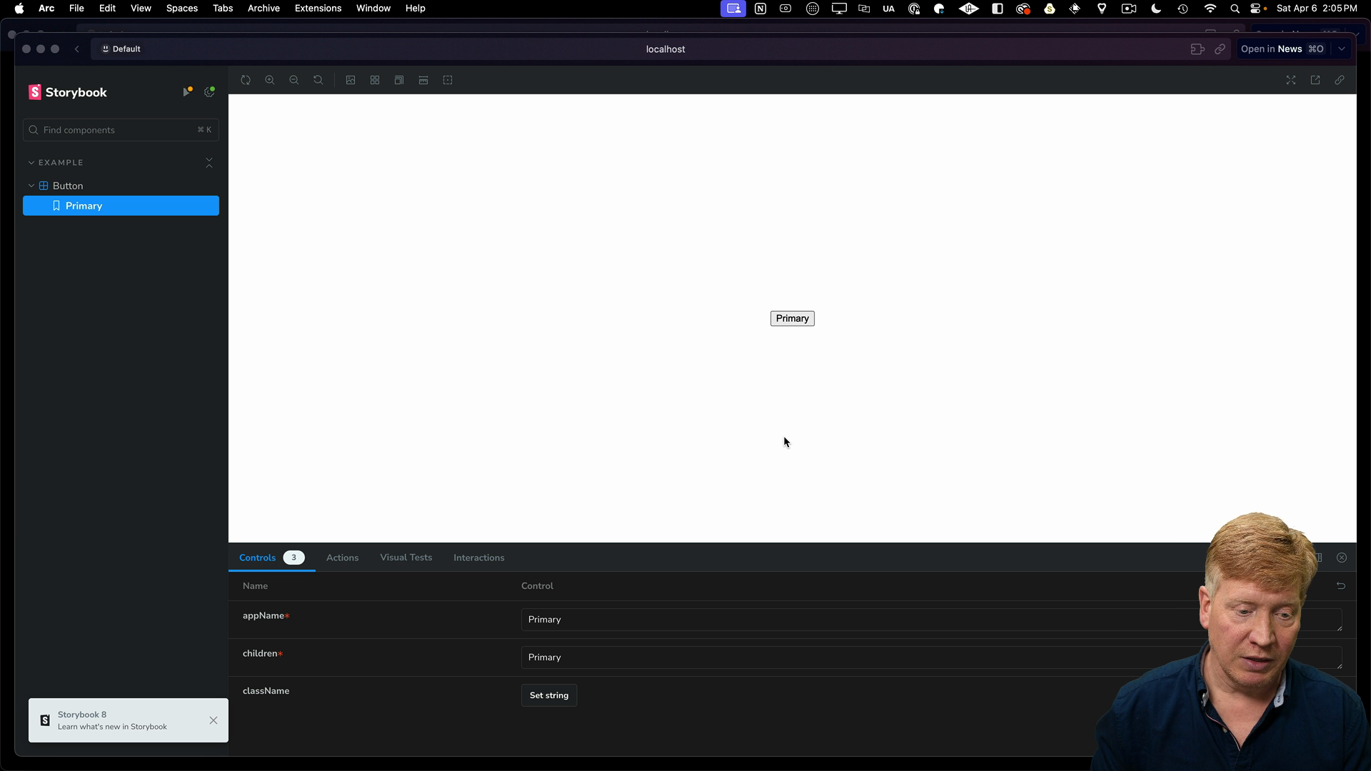
Running Multiple Storybooks Simultaneously
With Turborepo, you can run multiple Storybooks simultaneously.
Inside the packages/ui/package.json file we can see that Storybook is set to run on port 6006:
// inside packages/ui/package.json

scripts: {
  ...
  "storybook": "storybook dev -p 6006",
}
Set the ports to 6007 and 6008 for the apps/main-site and apps/storybook respectively.
Next, inside of the turbo.json file in the root of the project, we can add a storybook task definition. We'll also set the experimentalUi flag to true to enable the experimental UI feature:
{
  "$schema": "https://turbo.build/schema.json",
  "globalDependencies": ["**/.env.*local"],
  "experimentalUI": true,
  "pipeline": {
    "build": {
      "dependsOn": ["^build"],
      "outputs": [".next/**", "!.next/cache/**"]
    },
    "lint": {
      "dependsOn": ["^lint"]
    },
    "dev": {
      "cache": false,
      "persistent": true
    },
    "storybook": {
      "interactive": true,
      "cache": false,
      "persistent": true
    }
  }
}
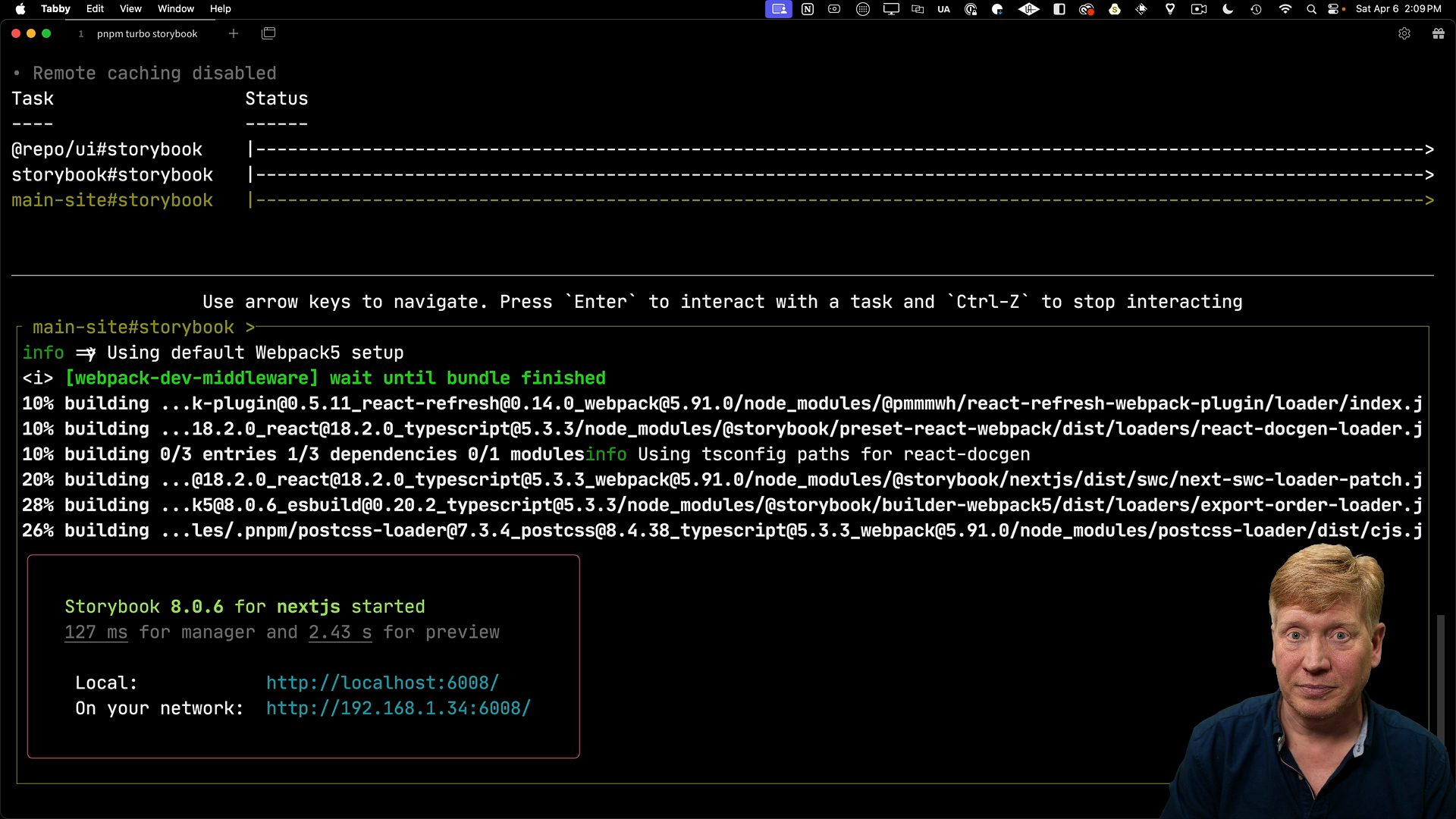
With these settings, we can run Storybook across multiple apps simultaneously by running the following command in the root of the project:
pnpm turbo storybook
The experimental UI allows you to navigate between different Storybooks and interact with their respective terminals:
Whether you choose to add Storybook to individual apps, UI libraries, or create a centralized Storybook app, Turborepo makes it easy to manage and run multiple Storybooks simultaneously.