Here are the styled components for Main and Card:
// inside page.tsx

const Main = styled.main`
  margin: 0 auto;
  max-width: 960px;
  background-color: black;
  display: flex;
  flex-wrap: wrap;
`;

const Card = styled.div`
  width: 33%;
  padding: 0.2rem;
  @media screen and (max-width: 768px) {
    width: 100%;
  }
`;
With the components created, we can update the Home component to use them:
export default function Home() {
  return (
    <Main>
      {PRODUCTS.map((product) => (
        <Card key={product.id}>
          <ProductCard product={product} />
        </Card>
      ))}
    </Main>
  );
}
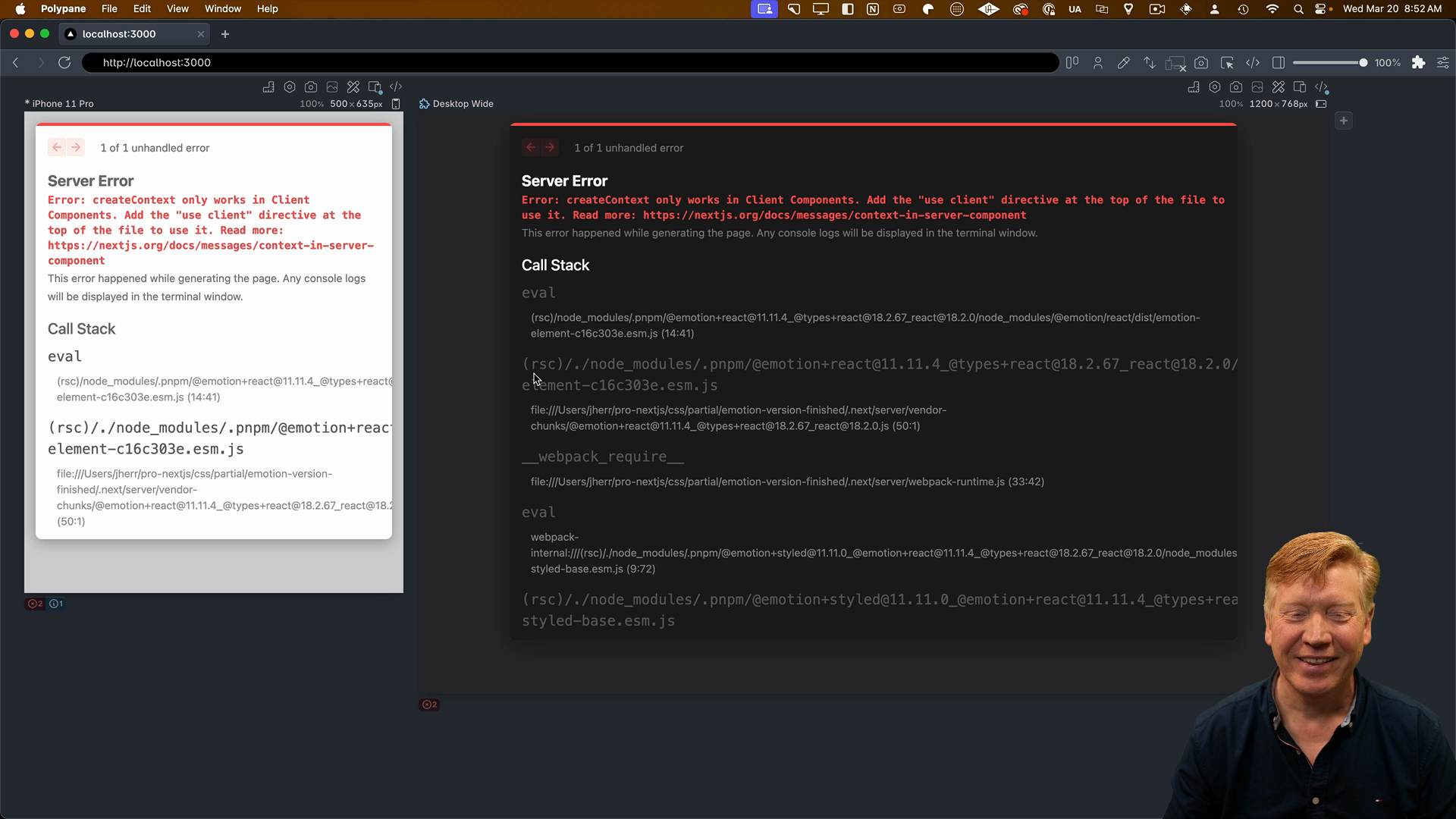
When you save the file, you'll probably see an error message that says "createContext only works in Client Components":

We get the error because our page component is not currently a Client Component. To fix this, we need to add the 'use client' directive at the top of the file:
// inside page.tsx
"use client";
import styled from '@emotion/styled'
...
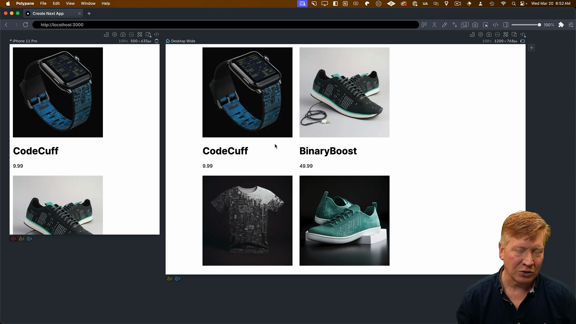
Save the file again, and the styles should now be applied correctly:

Adding Light/Dark Theme Styles
Inside of globals.css we can remove the background-color: black; style from the body in our CSS reset since we don't need it anymore. We can also add CSS styles for light and dark themes:
*,
*::before,
*::after {
  box-sizing: border-box;
}
img {
  max-width: 100%;
  display: block;
}

body {
  font-family: Arial, Helvetica, sans-serif;
  background-color: white;
  color: black;
}

@media (prefers-color-scheme: dark) {
  body {
    background-color: black;
    color: white;
  }
}
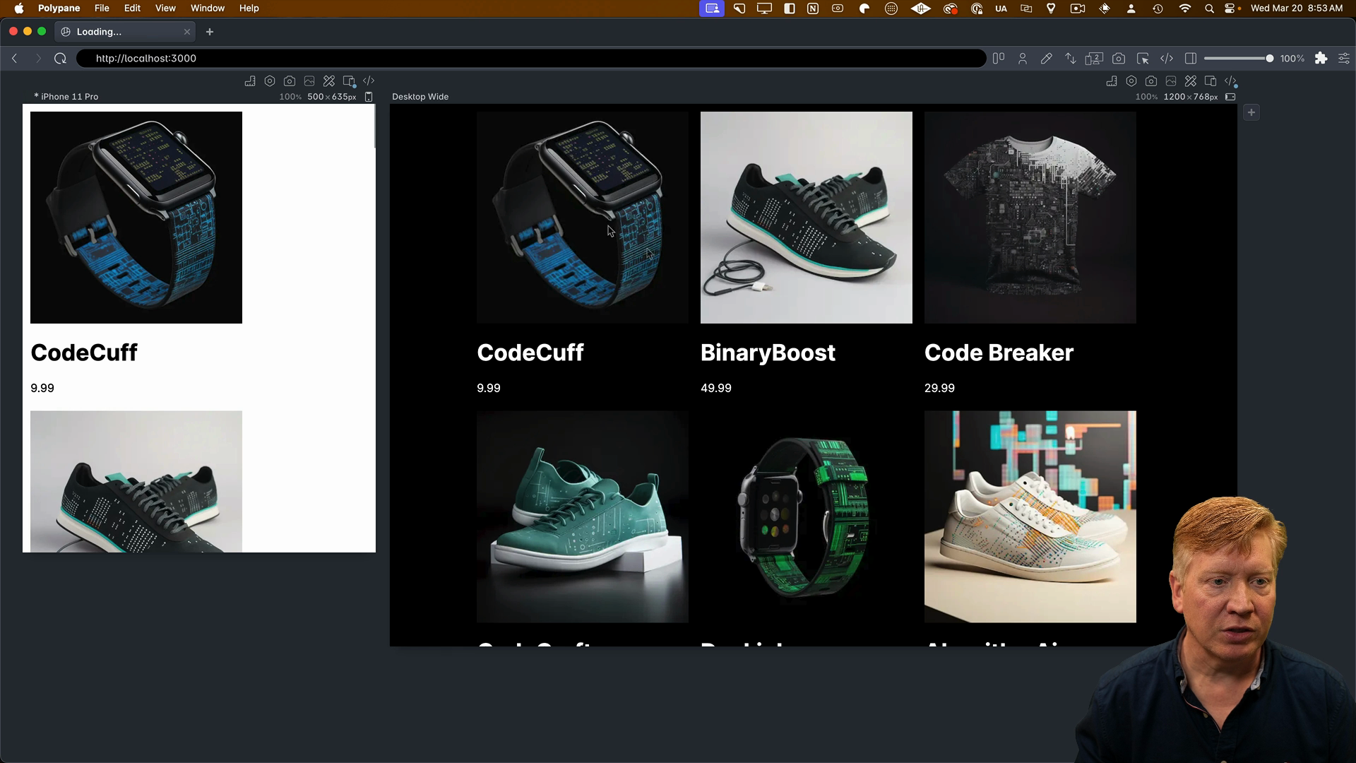
This defaults the body styles to a white background with black text. Then, it uses a media query to change the styles to a black background with white text when the user's system is set to dark mode.
Save the file and take a look at the results. The page should now respond to your system's light/dark mode setting, automatically switching between the two themes.

Styling the Product Card
To finish things off, let's style our ProductCard component.
First, import the styled function from @emotion/styled:
import styled from '@emotion/styled'
Like before, we'll create some styled components for the Card, CardContainer, ImageContainer, InfoContainer, and the Title and Price:
const Card = styled.div`
  container-type: inline-size;
  width: 100%;
`;

const CardContainer = styled.div`
  display: flex;
  width: 100%;
  @container (max-width: 450px) {
    flex-direction: column;
  }
`;

const ImageContainer = styled.div`
  width: 25%;
  @container (max-width: 450px) {
    width: 100%;
  }
  & img {
    width: 100%;
    height: auto;
    @container (max-width: 450px) {
      border-top-right-radius: 1rem;
      border-top-left-radius: 1rem;
    }
    @container (min-width: 450px) {
      border-top-left-radius: 1rem;
      border-bottom-left-radius: 1rem;
    }
  }
`;

const InfoContainer = styled.div`
  padding-left: 1rem;
  @container (max-width: 450px) {
    width: 100%;
    border-bottom: 1px solid #666;
    border-top: none;
    border-left: 1px solid #666;
    border-right: 1px solid #666;
    border-bottom-right-radius: 1rem;
    border-bottom-left-radius: 1rem;
  }
  @container (min-width: 450px) {
    width: 75%;
    border-bottom: 1px solid #666;
    border-top: 1px solid #666;
    border-right: 1px solid #666;
    border-top-right-radius: 1rem;
    border-bottom-right-radius: 1rem;
  }
`;

const Title = styled.h1`
  margin: 1rem 0 0 0;
  font-size: 1.5rem;
`;

const Price = styled.p`
  margin: 0 0 1rem 0;
  font-size: 1rem;
  font-style: italic;
`;
Note that the ImageContainer includes & img to style the image inside the container, since we will apply different styles based on the container query.
Apply the components to the ProductCard JSX:
export const ProductCard = ({ product }: Props) => {
  return (
    <Card>
      <CardContainer>
        <ImageContainer>
          <Image
            src={product.image}
            alt={product.title}
            width={300}
            height={300}
          />
        </ImageContainer>
        <InfoContainer>
          <Title>{product.title}</Title>
          <Price>{product.price}</Price>
        </InfoContainer>
      </CardContainer>
    </Card>
  );
};
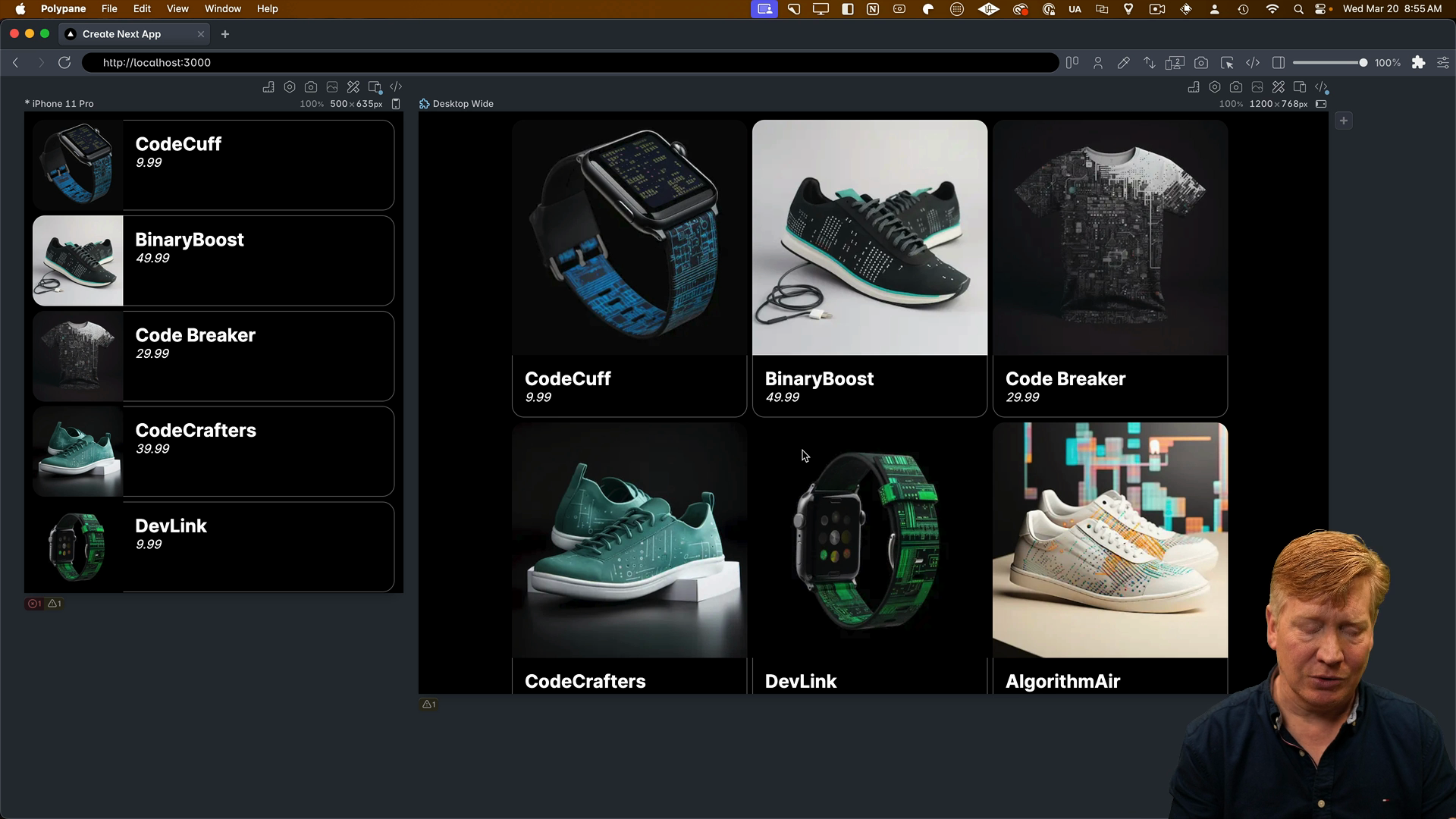
Now save the file, and you should see the styles applied to the product card:

A Note on Client Components
You might be wondering why this works even though we didn't add the 'use client' directive to the ProductCard component. The reason is that the page.tsx file is already a Client Component because of the 'use client' directive at the top. This establishes a boundary, and anything that page.tsx imports and uses inherits that directive and becomes a Client Component as well.
So in this case, ProductCard doesn't need the 'use client' directive because it's being imported and used by a component that is already a Client Component. However, if page.jsx was a Server Component, then ProductCard would need the 'use client' directive to use Emotion's styled function.
A Note on Using Emotion with the App Router
I want to be honest with you- personally, I wouldn't recommend using Emotion with the App Router. I don't think it's the ideal combination.
When you're working with the App Router, I believe it's better to use either CSS Modules or a build-time solution like StyleX or Pigment.
Pigment, in particular, offers a similar styled-component syntax to Emotion, so if you like that style of defining your styles, I'd recommend switching to Pigment.
The main benefits of using a build-time solution over Emotion are that you don't need to set up the Emotion registry, and the CSS will be more performant because there's no runtime CSS generation on the client.
While it's certainly possible to use Emotion with the App Router, I think there are other styling solutions out there that are better suited to the App Router's design and goals.
Just remember to consider the tradeoffs and explore alternative styling solutions that might be a better fit for your project.