ProNextJS
    Loading
    lesson

    Setting up Storybook with Next.js

    Jack HerringtonJack Herrington

    NOTE: To get Tailwind to work in your Storybook previews you'll need to import your globals.css into preview.ts

    // .storybook/preview.ts
    import "../src/app/globals.css"
    

    Storybook is a great way to demo and test your components in isolation, separate from your main application. This makes it a valuable tool for working with designers and product managers, letting you focus on the UI and functionality of individual components.

    Creating a Next.js Project

    To get started, let's create a new Next.js project using the create-next-app command:

    pnpm dlx create-next-app@latest storybook-with-nextjs --use-pnpm
    

    Select the options for TypeScript, ESLint, Tailwind CSS, and the app router when prompted.

    Next, we'll install Storybook and set it up in our project:

    npx storybook@latest init
    

    Storybook will detect that we're using a Next.js project and configure itself accordingly. When installation is complete, Storybook will automatically launch in your browser.

    Navigating Storybook

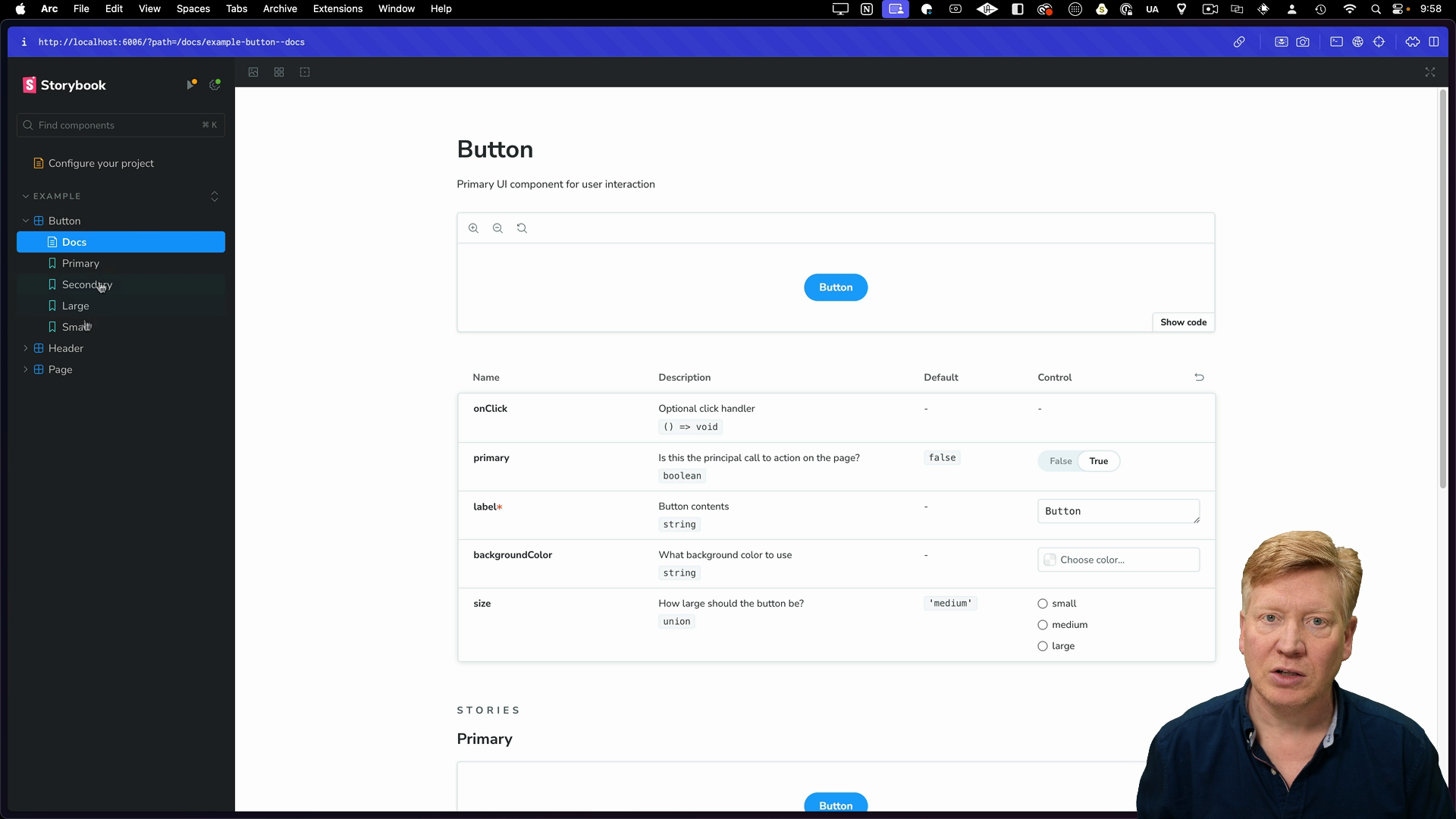
    Storybook has a sidebar with the components you've added, like the example button. You can navigate through these components, change their props, and see how they behave in different scenarios.

    the button story

    Project Structure

    Inside of the src directory, Storybook adds a stories folder with example components like the button. The button component itself is implemented in Button.tsx, and its stories are defined in Button.stories.ts.

    The Button.stories.ts file has a meta block that specifies metadata for the component, like its title, location in the navigation bar, and the component itself. It also has an argTypes section that defines the available props for the button and how they should appear in the Storybook UI.

    // inside Button.stories.ts
    
    const meta = {
      title: 'Example/Button',
      component: Button,
      parameters: {
        layout: 'centered',
      },
      tags: ['autodocs'],
      argTypes: {
        backgroundColor: { control: 'color' },
      }
    }
    

    After the meta block, you'll see individual stories for the button component. Each story shows a different use case or variation of the component with specific props:

    export const Primary: Story = {
      args: {
        primary: true,
        label: 'Button',
      },
    };
    
    export const Secondary: Story = {
      args: {
        label: 'Button',
      },
    };
    
    export const Large: Story = {
      args: {
        size: 'large',
        label: 'Button',
      },
    };
    

    Integrating a Custom Button Component

    Let's bring the button component into our app.

    First move the Button.tsx and Button.stories.ts files from the stories directory to the app directory, then remove the stories directory.

    Now, let's add our own button component to Storybook. We'll move the existing Button and Button.stories.tsx files from the stories directory into our app directory.

    Open the demo Button.tsx file and replace the existing code with this new button that uses Tailwind CSS for styling:

    export default function Button({ label }: { label: string }) {
      return (
        <button className="px-5 py-2 bg-blue-800 text-white text-2xl">
          {label}
        </button>
      );
    }
    

    This code defines a simple button component using Tailwind CSS classes for styling.

    Next, open the Button.stories.tsx file and update it like this:

    import type { Meta, StoryObj } from '@storybook/react'
    import Button from './Button'
    
    const meta = {
      title: 'Example/Button',
      component: Button,
      parameters: {
        layout: 'centered',
      },
      tags: ['autodocs'],
      argTypes: {
        backgroundColor: { control: 'color' },
      }
    } satisfies Meta<typeof Button>
    
    export default meta
    type Story = StoryObj<typeof meta>
    
    export const Primary: Story = {
      args: {
        label: 'Button',
      },
    }
    

    This code defines the meta information for our button component and includes a single story named "Primary" that renders the button with the label "Button".

    Running Storybook

    With our button component integrated, we can now run Storybook again:

    pnpm storybook
    

    There is also a build-storybook script that has been added to the package.json file. This script generates a static version of Storybook that you can deploy own its own.

    Storybook is running

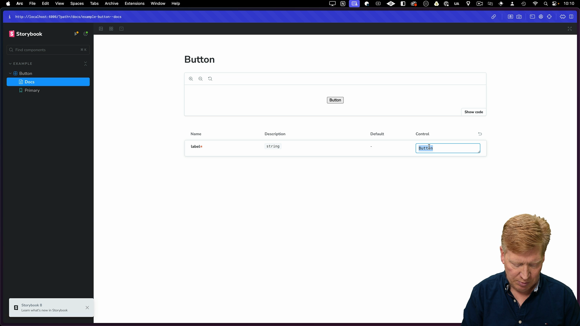
    You should now see our custom button component in the Storybook UI, with the Tailwind CSS styling. You can interact with the component, change its label, and explore its behavior in isolation.

    Next Steps

    There's a lot more that Storybook can do beyond the example here. Check out the Storybook docs to learn more about its features and how to make the most of it in your projects.

    We'll be revisiting Storybook later when we look at integrating it into monorepos and shared design systems.

    Transcript

    Let me show you how to set up the awesome Storybook with Next.js. Storybook is a fantastic way to demo your components in isolation from where they might be used in the application. That can be really handy when you're working with your designer or your product manager to hone in on the UI of just specific components in your application. All right. Let's start off by building our application.

    We're going to call it Storybook with Next.js. This is really simple, so it'll be really quick. I'll start off with all my defaults. Yes to TypeScript, yes to ESLint, yes to Tailwind, Yes to the source directory, of course. Yes to the app router.

    And no to changing the import alias. I'll bring that up in VS Code. And in that console, I'm gonna do mpx to run Storybook at the latest version. And I'm gonna run the init command on that to initialize our project with Storybook. Looks like it's doing a good job identifying that this is the next application.

    Now it's actually going to launch Storybook for us. To be honest, I kind of find that more of a hassle. We're going to skip the tour and I'll just show you around myself. So here is our example button. So this is the idea that you have this kind of panel over on the side where you can navigate around and see the different components that you have and actually go and try them out.

    For example, with our button case we can actually change the label here. So I can say, hello there. And you can kind of see how your component reacts to different prop changes. It's really nice. You can deploy this in isolation and let your designer or your product manager try out the different options before it actually goes in the application.

    It's fantastic, particularly for design systems. All right, let's go take a look at our project and see how it's actually integrated. So over in the source directory, we have a stories folder that has been added. It's got a bunch of assets. It's got, for example, our button in there.

    This is our button implementation. And then you've got some stories around it. So that's button.stories.ts. Importantly in the stories, there's the meta block and the meta block defines the metadata for your component. So in this case, we got the title.

    That's where it's actually gonna put it in the nav bar. So it's gonna put it under example and then slash button. You're gonna give it the component, which in this case is the button. Any parameters for the story in general, it's gonna lay out in the center. The tags auto docs means that it's going to automatically generate documentation from the stories, which we'll see below.

    Then you got the different argument types in this case, our background color, we want a color selector on that. And then any default arguments. Now in the case of our button, we've got a bunch of different stories, and each one of those stories comes with different arguments to show off different aspects of your component. Now let's actually try and bring this button into our app. So what I'm gonna do is I'm going to move out button and button stories into our app.

    And I'm gonna get rid of the stories altogether. Now over in button, I'm going to not use the styles. I'm gonna go and use Tailwind for this. So I'm just gonna create a whole new button. It does take a label which is a string.

    I'm gonna wrap button around that and I'll just give it some nice Tailwind styling. Okay that should be good. Let's go over and take a look at our button stories. Now we're exporting as the default so I no longer need to bring it in as a named constant. We don't have the background color controlling more or an on click.

    And I'll get rid of the primary here. In fact, I'll get rid of everything except the primary story. All right, let's give it a go. So to run this, I'm going to use pnpm storybook. Now that's actually been created over here in our package.json.

    When we did the storybook init, it automatically added storybook and build storybook. Storybook is essentially dev mode for storybook and build storybook builds a static storybook that you can then deploy on something like S3. So let's run Storybook. All right, there you go, looks really great. It's up and running and we can even change the label.

    Fantastic. So there it is, a quick and easy way to get Storybook into your Next.js application. They make it super easy. You should go and check out the documentation. There's a whole lot more that comes with Storybook that you should go and check out.

    It is a fantastic platform. We're going to take a look at it again when it comes to monorepos because there's a whole lot more involved when it comes to bringing it into a monorepo and where exactly you want to share your storybook from, whether it is the applications or a shared design system package or all of the applications in kind of a meta storybook. There's a lot of different ways you can roll it out there.