Next.js 14 introduced Lego Components. These components are complete and self-contained just like real Lego blocks.
In this lesson, we'll convert the PokemonList component into a Lego component that can be shared between multiple applications in a Turborepo app.
Creating a Shared Lego Component
The first step is to move the PokemonList component into the packages/ui/src directory within the Turborepo. This will make it accessible to other applications.
To ensure the PokemonList component is usable, we need to configure its output. Update the package.json file within the packages/ui directory to export the PokemonList component:
// inside packages/ui/package.json

{
  "name": "@repo/ui",
  "version": "0.0.0",
  "private": true,
  "exports": {
    "./button": "./src/button.tsx",
    "./PokemonList": "./src/PokemonList/index.ts",
    "./card": "./src/card.tsx",
    "./code": "./src/code.tsx"
  },
  ...
We've specified that our Pokemon List component is accessible at @repo/ui/pokemon-list. Now, let's use this component in our main Next.js application.
In our main application's page.tsx, we'll import and render the Pokemon List component:
// apps/client-server-component/app/page.tsx

import PokemonList from "@repo/ui/PokemonList";

export default function Home() {
  return (
    <>
      <h1 className="text-4xl mb-5 border-b-2">Home Application</h1>
      <PokemonList />
    </>
  );
}
Creating a Second App and Reusing the Component
To show the reusability of our Lego Component, let's create a second Next.js application within our Turborepo called second-app.
At the terminal in the apps directory, copy everything fomr client-server-component to second-app:
cp -r client-server-component second-app
Then update the package.json' in the second-app directory to have a unique name:
// inside apps/second-app/package.json

{
  "name": "second-app",
  ...
}
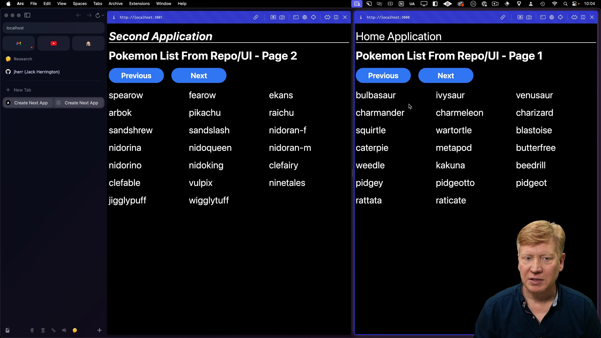
Once the second application is set up, we can render the Pokemon List component with a "Second Application" header and know that it's working.
However, there's an issue where the Tailwind CSS styles are not being applied to the Pokemon List component.
Styling Lego Components
We need to update the tailwind.config.js file in both applications to include the packages/ui directory in the list of directories that Tailwind CSS should scan for styles:
// inside tailwind.config.ts in both apps:
import type { Config } from "tailwindcss";

const config: Config = {
  content: [
    "./src/pages/**/*.{js,ts,jsx,tsx,mdx}",
    "./src/components/**/*.{js,ts,jsx,tsx,mdx}",
    "./src/app/**/*.{js,ts,jsx,tsx,mdx}",
    "../../packages/ui/**/*.{js,ts,jsx,tsx,mdx}",
  ],
  ...
With this configuration, Tailwind CSS will apply the necessary styles to the Pokemon List component which are picked up in both apps:

Configuring Lego Components
Lego Components can be thought of similarly to micro-frontends. Componets like the PokemonList are self-contained UI pieces that can talk to the server, manage their own state, and be dropped onto a page like Lego blocks.
There are two primary methods to configure Lego components.
Using props directly in the component is flexible, but can be repetitive depending on how you set things up.
Using environment variables is ideal for settings that vary between development, staging, and production environments. In our server code, we can access environment variables using process.env.
For this specific example, utilizing environment variables to define the Pokemon API URL is a more efficient and maintainable solution, especially when dealing with multiple environments.
When you're building an App Router application, think about leveraging the Lego Component idea!