ProNextJS
    lesson

    Configure Container Queries with Tailwind CSS

    Jack HerringtonJack Herrington

    The first step for creating the layout is to add the following classes to the main container:

    <main className="mx-auto max-w-[960px] flex flex-wrap">
      <!-- ... -->
    </main>
    

    These classes will:

    • Center the container horizontally with mx-auto
    • Set a maximum width with max-w-[960px]
    • Use a flex layout with flex
    • Allow the flex items to wrap with flex-wrap

    Here's how the page should look now:

    Page after applying Tailwind classes

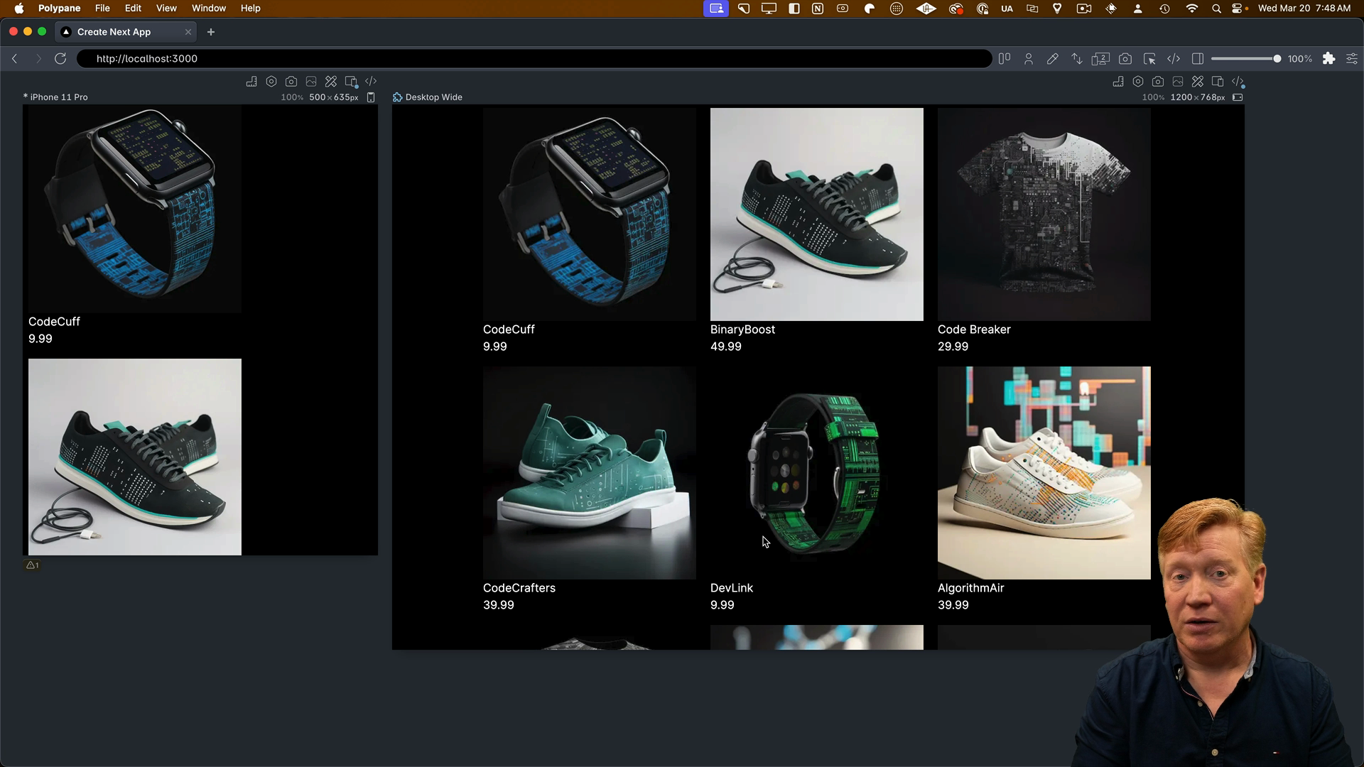
    If you're curious about why we're using these specific classes, revisit the CSS modules lessons where we dive into each of these CSS choices in detail.

    Adding Product Card Styles

    Inside of the ProductCard.tsx component file, we'll add the @container class to the wrapping div to enable container queries:

    export const ProductCard = ({ product }: Props) => {
      return (
        <div className="@container">
        ...
    

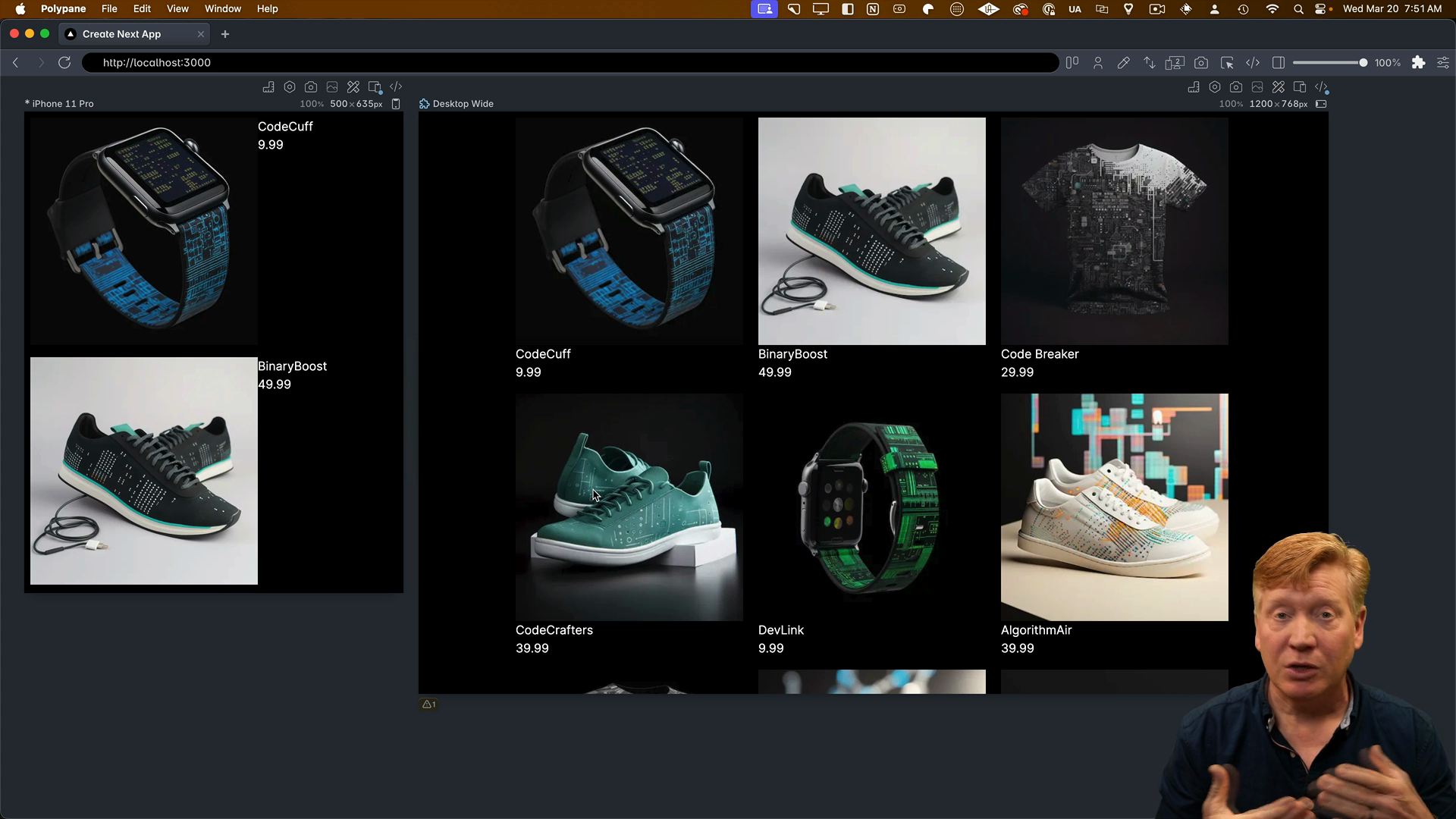
    In order to see the container query in action, we need to change the interior div from a flex row-based layout to a column-based layout. We can do this by adding the following classes:

    // Inside the ProductCard component
    <div className="@container">
      <div className="flex flex-col @md:flex-row">
        <div>
          <Image
            ...
          >
    

    This will use a column-based layout by default but switch to a row-based layout on medium-sized screens and above.

    However, since we're using Tailwind version 3, we'll need to add a plugin for container queries.

    Browser Support for Container Queries

    To add the container queries plugin, we need to stop the development server, then install the plugin:

    pnpm add -D @tailwindcss/container-queries
    

    Then inside of the tailwind.config.js file, we'll add the plugin:

    module.exports = {
      content: ["./src/**/*.{js,ts,jsx,tsx,mdx}"],
      theme: {
        extend: {},
      },
      plugins: [require("@tailwindcss/container-queries")],
    };
    

    After restarting the dev server, we can see the horizontal layout on small screens and the vertical layout on medium screens and above:

    The container query is working

    In Tailwind version 4, container queries are built-in, so you won't need to do this extra step. Thank you, Tailwind v4, for making our lives easier!

    Also, if you're worried about browser support for container queries, don't be. Globally, 91.33% of browsers support them according to Can I Use. This means you can use container queries in most projects without any issues.

    Finishing the Product Card

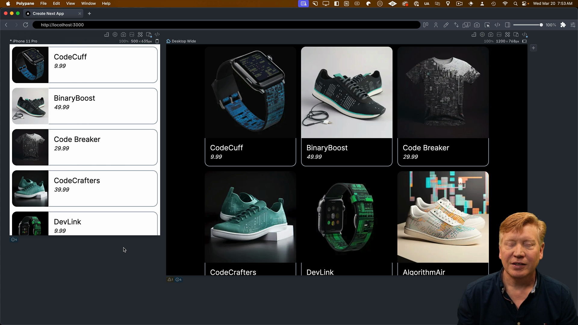
    To finish up the product card, we'll add a few more classes to the image and info container.

    The w-full h-auto classes will make the image take up the full width of the card in the vertical layout but only 25% of the width in the horizontal layout. The rounded- classes will add some rounding to the corners of the image:

    export const ProductCard = ({ product }: Props) => {
      return (
        <div className="@container">
          <div className="flex flex-col @md:flex-row">
            <div className="w-full @md:w-1/4">
              <Image
                src={product.image}
                alt={product.title}
                width={300}
                height={300}
                className="w-full h-auto rounded-tl-2xl rounded-tr-2xl @md:rounded-tr-none rounded-bl-none @md:rounded-bl-2xl"
              />
            </div>
            ...
    

    With these final changes, our product card is complete! It looks fantastic and handles both light and dark mode.

    Rounded corners in light and dark mode

    Using Tailwind with CSS Modules

    In the next video, we'll explore a variation of how to use Tailwind that combines CSS modules with Tailwind using the @apply directive.

    Transcript

    All right, we're back over in our page.tsx file. To the main, I'm going to attach the classes of MXAuto, the max width, the flex, and the flex wrap, and then to the interior dim and to set the width, as well as the padding. Now, if you don't know why I'm doing any of this, be sure to go back to the CSS modules video where I talk about every 1 of these CSS

    choices in detail. I'll hit save, and now I've got our awesome three-card layout. It's looking pretty good. Now, the last thing we need to do is work on the product card. Now, the first class I'm going to add is to the exterior div, where I'm going to add the class name at container. That's going to specify that this is a container query container.

    So I'm going to hit save. Then to see that actually work, we need to change the interior div from a flex row-based layout to a column-based layout. So let's add the class name for that. So we're going to say that the base is a column and then in the medium size or below it's going to be a flex row. So let's

    hit save and see how that works. And that is not working. What we should see on the left-hand side in the small size, is we should see a horizontal layout and we're not seeing that. So what's happening is that in Tailwind version 3, you

    actually have to add a plugin for container queries. So let's go and stop our terminal. We'll go and add the plugin for container queries. And then over in our Tailwind configuration, we'll go

    and add that as a plugin. And let's try it again. Hit refresh and now we get a horizontal layout in mobile. So now we're getting container queries. Tailwind v4 container queries are built in. Thank you so much to Tailwind v4 for doing that. If you're worried about whether you can use container

    queries because media queries have been so prevalent all these years, well if you look over at can I use, you can see that globally 91.33 percent of browsers support container queries? So you pretty much can use container queries wherever you want. All right, let's finish up our product card. So around the image, I'm going to specify the

    width so that in the vertical layout it's full and the horizontal layout it's only a quarter or 25 percent. Then I have the rounding around the image, and then around the info container, I'm just going to add the classes for that. You can go and check out the finished versions in the repo if you want to go and drill into all of these. Let's hit save, let's

    see what we got. All right, there we go. Good looking. Of course, it handles the light and dark mode as well. Fantastic. All right. A completed Tailwind example. Now, there is a variation of how to use Tailwind that I want you to know about. And that's to use a combination of CSS modules and

    Tailwind by using the at apply directive. So we're going to take a look at that in the next video. We're going to port the product card to use that at apply. That's actually what's running the core system that you are working on right now. That's how they do their CSS. So you'll learn that in the next video.